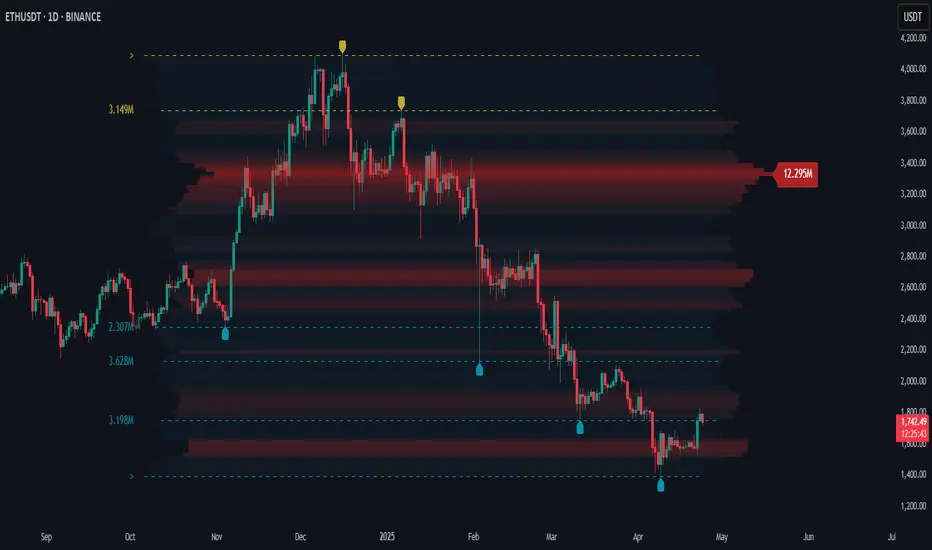
Volume Point of Control with Fib Based Profile🍀Description:
This indicator is a comprehensive volume profile analysis tool designed to identify key price levels based on trading activity within user-defined timeframes. It plots the Point of Control (POC), Value Area High (VAH), and Value Area Low (VAL), along with dynamically calculated Fibonacci levels derived from the developing period's range. It offers extensive customization for both historical and developing levels.
🍀Core Features:
Volume Profiling (POC, VAH, VAL):
Calculates and plots the POC (price level with the highest volume), VAH, and VAL for a selected timeframe (e.g., Daily, Weekly).
The Value Area percentage is configurable. 70% is common on normal volume profiles, but this script allows you to configure multiple % levels via the fib levels. I recommend using 2 versions of this indicator on a chart, one has Value Area at 1 (100% - high and low of lookback) and the second is a specified VA area (i.e. 70%) like in the chart snapshot above. See examples at the bottom.
Historical Levels:
Plots POC, VAH, and VAL from previous completed periods.
Optionally displays only "Unbroken" levels – historical levels that price has not yet revisited, which can act as stronger magnets or resistance/support.
The user can manage the number of historical lines displayed to prevent chart clutter.
Developing Levels:
Shows the POC, VAH, and VAL as they form in real-time during the current, incomplete period. This provides insight into intraday/intra-period value migration.
Dynamic Fibonacci Levels:
Calculates and plots Fibonacci retracement/extension levels based dynamically on the range between the developing POC and the developing VAH/VAL.
Offers 8 configurable % levels above and below POC that can be toggled on/off.
Visual Customization:
Extensive options for colors, line styles, and widths for all plotted levels.
Optional gradient fill for the Value Area that visualizes current price distance from POC - option to invert the colors as well.
Labels for developing levels and Fibonacci levels for easy identification.
🍀Characteristics:
Volume-Driven: Levels are derived from actual trading volume, reflecting areas of high participation and price agreement/disagreement.
Timeframe Specific: The results are entirely dependent on the chosen profile timeframe.
Dynamic & Static Elements: Developing levels and Fibs update live, while historical levels remain fixed once their period closes.
Lagging (Historical) & Potentially Leading: Historical levels are based on the past, but are often respected by future price action. Developing levels show current dynamics.
🍀How to Use It:
Identifying Support & Resistance: Historical and developing POCs, VAHs, and VALs are often key areas where price may react. Unbroken levels are particularly noteworthy.
Market Context & Sentiment: Trading above the POC suggests bullish strength/acceptance of higher prices, while trading below suggests bearishness/acceptance of lower prices.
Entry/Exit Zones: Interactions with these levels (rejections, breakouts, tests) can provide potential entry or exit signals, especially when confirming with other analysis methods.
Dynamic Targets: The Fibonacci levels calculated from the developing POC-VA range offer potential intraday/intra-period price targets or areas of interest.
Understanding Value Migration: Observing the movement of the developing POC/VAH/VAL throughout the period reveals where value is currently being established.
🍀Potential Drawbacks:
Input Sensitivity: The choice of timeframe, Value Area percentage, and volume resolution heavily influences the generated levels. Experimentation is needed for optimal settings per instrument/market. (I've found that Range Charts can provide very accurate volume levels on TV since the time element is removed. This helps to refine the accuracy of price levels with high volume.)
Volume Data Dependency: Requires accurate volume data. May be less reliable on instruments with sparse or questionable volume reporting.
Chart Clutter: Enabling all features simultaneously can make the chart busy. Utilize the line management inputs and toggle features as needed.
Not a Standalone Strategy: This indicator provides context and key levels. It should be used alongside other technical analysis tools and price action reading for robust decision-making.
Developing Level Fluctuation: Developing POC/VA/Fib levels can shift considerably, especially early in a new period, before settling down as more volume accumulates and time passes.
🍀Recommendations/Examples:
I recommend have this indicator on your chart twice, one has the VA set at 1 (100%) and has the fib levels plotted. The second has the VA set to 0.7 (70%) to highlight the defined VA.
Here is an example with 3 on a chart. VA of 100%, VA of 80%, and VA of 20%
Buscar en scripts para "volume profile"

Price Map Profile [BigBeluga]An advanced volume-based tool designed to map out how trading activity is distributed across price levels. It combines dynamic volume profiling with structural pivot detection to highlight key levels of interest in the market — including hidden support/resistance zones and dominant liquidity areas.
Unlike traditional volume profiles locked to fixed sessions, this indicator continuously processes historical bars to build a real-time "map" of volume distribution. It intelligently reveals where buyers and sellers were most active, helping traders pinpoint high-impact zones with clarity.
🔵 KEY FEATURES
Creates a volume map profile by scanning price action over a defined lookback window (`length`).
Divides price vertically into volume bins (default: 100) and aggregates either total volume or bar count per bin.
Bins are plotted as horizontal zones extending to the right of the chart — wider offset means more volume at that price.
Each zone is color-coded using gradients to represent volume magnitude:
- Below average volume = cool tones (blue/teal)
- Above average volume = warm tones (red/orange)
The highest volume bin is highlighted with a red label showing the exact volume, helping to identify strong price agreement.
Detects pivot highs and lows using a 15-bar swing method, marking them as potential S/R levels.
If a pivot level is located inside a low-volume zone (volume < average), it is emphasized with a dashed line and label .
Pivot line color matches direction:
- High pivots = yellow
- Low pivots = aqua
The volume of the bin containing the pivot is shown alongside the pivot, providing volume context for the structural level.
Filters out nearby duplicate pivots using ATR-based distance checks to ensure clean and non-redundant signals.
🔵 HOW TO USE
Use the wide red zones as liquidity and consolidation areas where price may stall, reverse, or absorb volume.
Pivot-based dashed lines within low-volume zones highlight hidden support/resistance levels where price may react sharply.
Combine this indicator with trend or order flow tools to validate reversal or breakout setups .
Switch between Volume and Frequency modes to adapt to the type of data your asset provides.
🔵 CONCLUSION
The Price Map Profile transforms raw volume into an actionable visual map. By aligning volume depth with key market structure levels, it helps traders identify where market participants are most active — and where hidden inefficiencies lie. Ideal for traders seeking precision entries, dynamic S/R zones, and deeper volume structure insight.
Volume Footprint Voids [BigBeluga]Volume Footprint Voids is a unique tool that uses lower timeframe calculation to plot different styles of single candle POC.
This indicator is very powerful for scalping and finding very precise entry and exits, spotting potential trapped traders, and more.
Unlike many other volume profiles, this aims to plot single candle profiles as well as their own footprints.
🔶 FEATURES
The script includes the following settings:
Windows: Plotting style and calculations
Coloring modes
Display modes
lower-timeframe calculations
🔶 CALCULATION
In the image above we can see how the script calculates each level position that will serve as a calculation process to see how much volume/closes there are within the levels.
In the image above, we can have a more clear example of how we count each candle close.
We use the prior screenshot as an example, after setting each level we will use the lower-timeframe input to measure the amount of closes within the ranges.
Depending on the lot size, the box will be larger or smaller, usually the POC will always have the highest box size.
NOTE: Size is the starting point, always from the low of the candle.
To find more voids, select a closer LTF to the current one you're using.
To find fewer voids, select a timeframe away from your current one.
Due to Pine Script limitations, we are only able to plot a certain amount of footprints, and we can't plot the whole history chart.
POC will be the largest block displayed, indicating the time point of control
Gray areas are closes above the average
Black are Void or imbalance that price will fill in the future, like FVG
The image above shows an incorrect size input that will lead to bad calculations, while on the other side, a correct size input that will lead to a clear vision and better calculation.
🔶 WINDOWS
The "▲▼" Mode will display delta buyers and delta sellers coloring with voids as black.
It also offers a gradient mode for a beautier visualization
The "Total Volume" mode will display the net volume within the lot size (closes within the levels).
This is useful to spot possible highest net volume within the same highest lot size.
The "POC + Gaps" will show both POC and Gaps as the highest block while all the rest will be considered as the smaller block.
This is useful to see where the highest lot were and if there are higher or lower imbalances within the candle
The last option "Gaps" will simply display the gaps as the highest block, while the POC as the lowest block.
This is useful to have a better view of the gaps areas
🔶 EXAMPLE
This is one of the most basic examples of how this script can be used. POC at the bottom creating a strong support area as price holds and creates higher voids gap that price fills while rising.
🔶 SETTINGS
Users have full control over the script, from colors to choosing the lower-timeframe inputs to disabling the lot size.

Magnifying Glass (LTF Candles) by SiddWolf█ OVERVIEW
This indicator displays The Lower TimeFrame Candles in current chart, Like Zooming in on the Candle to see it's Lower TimeFrame Structure. It plots intrabar OHLC data inside a Label along with the volume structure of LTF candle in an eloquent format.
█ QUICK GUIDE
Just apply it to the chart, Hover the mouse on the Label and ta-da you have a Lower Timeframe OHLC candles on your screen. Move the indicator to the top and shrink it all the way up, because all the useful data is inside the label.
Inside the label: The OHLC ltf candles are pretty straightforward. Volume strength of ltf candles is shown at bottom and Volume Profile on the left. Read the Details below for more information.
In the settings, you will find the option to change the UI and can play around with Lower TimeFrame Settings.
█ DETAILS
First of all, I would like to thank the @TradingView team for providing the function to get access to the lower timeframe data. It is because of them that this magical indicator came into existence.
Magnifying Glass indicator displays a Candle's Lower TimeFrame data in Higher timeframe chart. It displays the LTF candles inside a label. It also shows the Volume structure of the lower timeframe candles. Range percentage shown at the bottom is the percentage change between high and low of the current timeframe candle. LTF candle's timeframe is also shown at the bottom on the label.
This indicator is gonna be most useful to the price action traders, which is like every profitable trader.
How this indicator works:
I didn't find any better way to display ltf candles other than labels. Labels are not build for such a complex behaviour, it's a workaround to display this important information.
It gets the lower timeframe information of the candle and uses emojis to display information. The area that is shown, is the range of the current timeframe candle. Range is a difference between high and low of the candle. Range percentage is also shown at the bottom in the label.
I've divided the range area into 20 parts because there are limitation to display data in the labels. Then the code checks out, in what area does the ltf candle body or wick lies, then displays the information using emojis.
The code uses matrix elements for each block and relies heavily on string manipulation. But what I've found most difficult, is managing to fit everything correctly and beautifully so that the view doesn't break.
Volume Structure:
Strength of the Lower TimeFrame Candles is shown at the bottom inside the label. The Higher Volume is shown with the dark shade color and Lower Volume is shown with the light shade. The volume of candles are also ranked, with 1 being the highest volume, so you can see which candle have the maximum to minimum volume. This is pretty important to make a price action analysis of the lower timeframe candles.
Inside the label on the left side you will see the volume profile. As the volume on the bottom shows the strength of each ltf candles, Volume profile on the left shows strength in a particular zone. The Darker the color, the higher the volume in the zone. The Highest volume on the left represents Point of Control (Volume Profile POC) of the candle.
Lower TimeFrame Settings:
There is a limitation for the lowest timeframe you can show for a chart, because there is only so much data you can fit inside a label. A label can show upto 20 blocks of emojis (candle blocks) per row. Magnifying Glass utilizes this behaviour of labels. 16 blocks are used to display ltf candles, 1 for volume profile and two for Open and Close Highlighter.
So for any chart timeframe, ltf candles can be 16th part of htf candle. So 4 hours chart can show as low as 15 minutes of ltf data. I didn't provide the open settings for changing the lower timeframe, as it would give errors in a lot of ways. You can change the timeframe for each chart time from the settings provided.
Limitations:
Like I mentioned earlier, this indicator is a workaround to display ltf candles inside a label. This indicator does not work well on smaller screens. So if you are not able to see the label, zoom out on your browser a bit. Move the indicator to either top or bottom of all indicators and shrink it's space because all details are inside the label.
█ How I use MAGNIFYING GLASS:
This indicator provides you an edge, on top of your existing trading strategy. How you use Magnifying Glass is entirely dependent on your strategy.
I use this indicator to get a broad picture, before getting into a trade. For example I see a Doji or Engulfing or any other famous candlestick pattern on important levels, I hover the mouse on Magnifying Glass, to look for the price action the ltf candles have been through, to make that pattern. I also use it with my "Wick Pressure" indicator, to check price action at wick zones. Whenever I see price touching important supply and demand zones, I check last few candles to read chart like a beautiful price action story.
Also volume is pretty important too. This is what makes Magnifying Glass even better than actual lower timeframe candles. The increasing volume along with up/down trend price shows upward/downward momentum. The sudden burst (peak) in the volume suggests volume climax.
Volume profile on the left can be interpreted as the strength/weakness zones inside a candle. The low volume in a price zone suggests weakness and High volume suggests strength. The Highest volume on the left act as POC for that candle.
Before making any trade, I read the structure of last three or four candles to get the complete price action picture.
█ Conclusion
Magnifying Glass is a well crafted indicator that can be used to track lower timeframe price action. This indicator gives you an edge with the Multi Timeframe Analysis, which I believe is the most important aspect of profitable trading.
~ @SiddWolf

Market Profile Visible RangeSup TV, 2 important points .
1) surprisingly, it's the first MP Visible Range script on TV;
2) This one doesn't use any bagging/binning*, instead each row represents the time spent on the actual minimal price steps (aka ticks).
The script will be further extended with usual market profile related functionally in future updates. At this point we have:
- Profile itself (each row represents how many bars touch the given price);
- Mode of the profile (called POC)**;
* Still it will be introduced in future when I will find / design the proper aggregating technique. It is vital for processing very wide price ranges (for example, 500 days on ES futures).
** The script correctly calculates POC by finding all the modes in the data & choosing the closest one to data's midrange.
For this kind of technical instrument finally it was more convenient to use Pine Script 5 (btw it's my first Pine 5).
Basically this script is a side-effect of another R&D I'm doing, the stuff is useful tho so let's go.
By choosing length we both specify the amount of data to be processed & the profile's location screen-wise. It's pretty cool and & useful, on my screen it's always almost touching the left side and still always visible.
The code is heavily commented in order to be understood fast, nothing fantastic, just a lil patience required this time.
Rationale
Market & volume profiles are well known concepts, lotta info available, the most important point of all that is that MP is just another way of visualizing data that lets you notice things you don't usually notice on sequential charts. From my side I can only add that it's better to use your own brain for thinking and reconsidering using volume profile in all the cases, especially on decentralized markets (unless you're aggregating ALL the volume data from everywhere, including options, OTC etc).
Here is it, for you

Order Flow ProfileOrder Flow Profile - Real-Time Buyer vs Seller Control
Order Flow Profile is a clean, dynamic tool that visualizes live order flow directly on your chart through a vertical price-level histogram. Unlike lagging indicators or standard volume profiles, this script uses data in real time, showing exactly who's in control—buyers or sellers—at each price zone.
The core originality lies in its straightforward delta stacking: it builds a persistent vertical bar that updates live with every trade, revealing aggressive buying/selling pressure without delays. This helps traders better visualize buyer and seller pressure before price develops.
METHODOLOGY & CORE CONCEPTS
1. Delta Calculation & Color Coding
The script tracks net volume delta (aggressive buys minus aggressive sells) at each price level:
- Green bars represent positive delta — aggressive buyers stepping in on the bid, often absorbing selling and signaling control.
- Red bars show negative delta — sellers hitting the ask hard, pushing price down or capping rallies.
- Black neutral zone highlights areas of balance where buying and selling roughly cancel out, typically indicating absorption by larger players or fair value zones.
This creates a live "profile" that grows vertically as data accumulates, making it easy to see momentum shifts at specific prices.
2. Dynamic Pressure Visualization
Once delta is calculated per price, it's stacked into a single, evolving vertical bar. The bar thickens in green when buyers dominate (potential support/reversal), or in red when sellers take over (potential resistance/rejection). The black section acts as a fair value anchor—price drifting there often means chop until one side breaks out.
No fixed lookback periods or smoothing; it uses raw, real-time flow to adapt instantly to market conditions.
FEATURES & CUSTOMIZATION
- Visibility Toggle: Show/hide the profile to keep your chart clean.
- Depth Adjustment: Control how much historical delta is displayed for longer-term context.
- Opacity & Colors: Fully customizable for better layering with candlesticks or other
indicators.
- Alerts: Set notifications for when delta flips—say, when green overtakes red or vice versa.
- Timeframe Agnostic: Works on any chart, but shines on intraday—especially one- to fifteen-minute tapes.
HOW TO USE IT
You can use the Order Flow Profile as a filter and pair it with any indicator.
If price taps the green zone and bounces, buyer control may be present.
Red at resistance with rejection can signal seller dominance on retests.
Black? Stay out of it. Let the buyers and sellers fight it out.
This indicator is intended for educational and analytical purposes only and should be used alongside proper risk management.
⚠️ Disclaimer
This script is an analytical tool and does not provide financial advice. All trading involves risk. Past performance is not indicative of future results. Please conduct your own analysis before making any trading decisions. The creators are not responsible for any financial losses.

The Tokyo ProtocolThe Tokyo Protocol: Multi-Pillar Market Regime Engine
The Tokyo Protocol is a high-performance trend-regime filter designed primarily for the 5-minute timeframe. Rather than providing lagging "Buy/Sell" signals, this script acts as a Mechanical Decision Engine. It synthesizes Price Action, Volatility-Adjusted Momentum, and Volume Flow to determine the "Path of Least Resistance."
How It Works
The script evaluates the market through four proprietary lenses to ensure you are only trading when the "environmental wind" is at your back:
Structural Bias (The Foundation): Uses Yesterday’s Floor Pivots with a tick-based buffer zone to establish the Daily Regime. It requires a confirmed "Regime Shift" (user-tunable) to prevent flickering in choppy markets.
Normalized Momentum (MACD Z-Score): Unlike standard MACD, this engine calculates the Standard Deviation of the MACD line. It identifies "UP_SEPARATED" (accelerating trends) versus "FLAT_HUGGING" (dangerous chop) using Z-score thresholds.
Volume Flow & Profile: Integrates OBV Slope analysis and a Mechanical Volume Profile to find High-Liquidity Support/Resistance nodes. It detects if a move is being fueled by "Smart Money" or if it is an "Exhaustion" move.
Divergence Hysteresis: A refined, pivot-based divergence engine (RSI & OBV) identifies "Real" vs. "False" price moves, preventing you from buying into a structural trap.
The "Action" Engine: Understanding "GO"
The most important feature of this script is the Action Table.
GO: This is NOT a "Buy Now" signal. It is an Environment Validation. It indicates that the structural bias, volume flow, and momentum are all synchronized. Use "GO" as a green light to execute your own specific entry triggers (flags, candle patterns, etc.) with higher probability.
WAIT: Indicates "Energy Loss" or "Regime Weakening." The trend may be intact, but the internal health of the move is deteriorating.
REVERSAL: Triggered when the price is still above/below the pivot, but internal metrics (RSI/MACD/OBV) have aligned aggressively against the current direction.
SKIP: No structural edge. Market is in a neutral squeeze.
Best Use Case
Timeframe: Optimized for 5m (Day Trading).
How to Enter: The "Primed" Strategy
IMPORTANT: This is not a "Market Order" indicator. A "GO" signal does not mean "Buy at Market." It means the market environment is primed for that direction for the remainder of the session.
The Entry Blueprint:
Wait for the Signal: The system identifies a LONG or SHORT bias and provides a GO status.
The Pullback: Once the "GO" appears, do not chase the price. Look for a pullback to a key structural level (Daily Pivot, Fibonacci retracement, or High-Liquidity Support).
The Continuation: Execute on the bounce/rejection from that level.
Targets: Optimized for 1.5:1 to 2:1 Reward-to-Risk ratios.
Timing Note: This engine is designed to be used after the first 15 minutes of a major market open (Tokyo, London, or New York). It uses the initial opening volatility to calibrate the regime and then capitalizes on the sustained momentum of the session.
The History: From AI to Pine Script
The Tokyo Protocol began as a manual process to remove the emotional "guesswork" of directional bias during the Asian Open. By using AI to review live market snapshots against parameters developed over years of trading, I found high accuracy but a "long-winded" workflow (manual calibration and constant snapshotting).
After building a deterministic engine and completing over 500 backtests, I realized the logic was robust enough to be fully automated. This Pine Script is the result of that transition—taking a high-level AI analysis workflow and hard-coding it into a responsive, real-time trading tool.
Backtest Insight
Data indicates that trades completed within the first hour of a signal often have a lower win rate than those that develop over 2+ hours. When you see a GO signal, remember that the session is primed for that direction over the course of the session. Be patient, wait for your levels, and let the trade develop.
Technical Pillars
Structural Bias: Daily Floor Pivots with a tick-based hysteresis buffer.
Momentum Z-Score: Normalizes MACD to distinguish between trend acceleration and "hugging" chop.
Volume Flow: Integrates OBV Slope and a Mechanical Volume Profile to find "Smart Money" nodes.
Divergence Engine: Refined RSI/OBV logic to filter out structural traps and exhaustion.
Action Table Glossary
GO: The environment is synchronized. Look for entries in the bias direction.
WAIT: Energy loss or regime weakening. Sit on your hands.
REVERSAL: Internal metrics have flipped against the regime. Watch for a trap.
SKIP: No structural edge. Neutral/Chop.
Role: Use as a "Parent Filter." If the Protocol says WAIT or SKIP, sit on your hands. If it says GO, look for entries in the indicated direction.

Hedge Fund Trading System Core Components
1. Factor Model
The heart of HFTS is a four-factor scoring system:
Value Factor: Measures price deviation from fair value (historical mean). Positive scores indicate undervaluation; negative scores indicate overvaluation.
Momentum Factor: Risk-adjusted momentum measuring recent returns relative to volatility. Identifies trending strength.
Carry Factor: Approximates institutional carry trades using price structure analysis (configurable methods).
Macro Regime: Long-term trend regime detection (BULL/BEAR/NEUTRAL) using slope-normalized moving averages.
Each factor is normalized and combined into a Combined Factor Score ranging from -1 (extremely bearish) to +1 (extremely bullish).
2. Trend Filter (EMA Cloud)
Triple EMA system (21/55/200) providing:
Short-term trend direction (Fast vs Slow EMA)
Macro trend context (200 EMA)
Visual cloud for trend state
3. Adaptive Volatility Bands
Dynamic bands that expand/contract based on current volatility regime:
HIGH volatility: Bands expand (wider stops needed)
LOW volatility: Bands contract (tighter entries possible)
NORMAL: Standard deviation
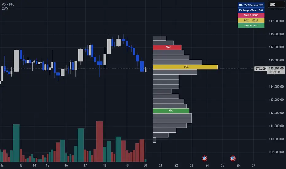
4. Volume Profile & VWAP
Volume Profile: Shows price levels with highest trading activity
POC (Point of Control): Highest volume price level
Value Area (VAH/VAL): 70% of volume concentrated zone
VWAP + Deviation Bands: Institutional execution benchmark
5. Risk Management Panel
Real-time position sizing and risk metrics:
Calculated position size based on account risk %
Stop distance (ATR-based)
Drawdown tracking with kill switch
Directional bias status
Z-Score Trading Strategy
The Z-Score is your mean reversion radar. It measures how many standard deviations price is from its 20-period mean.
Z-Score Levels:
Z-ScoreConditionMeaning> +2.5Extreme Overbought🔶 Diamond marker appears - potential short setup> +2.0OverboughtPrice extended above mean-2.0 to +2.0Normal RangeNo extreme conditions< -2.0OversoldPrice extended below mean< -2.5Extreme Oversold🔷 Diamond marker appears - potential long setup
How to Trade Z-Score Signals:
Mean Reversion Longs (Z < -2.0):
Wait for Z-Score to drop below -2.0 (oversold)
Look for diamond marker at extreme (-2.5)
Confirm Macro Regime is NOT "BEAR"
Enter when Z-Score starts turning UP (reversal confirmation)
Target: VWAP or Vol Band Basis (mean)
Stop: Below recent swing low or Vol Band Lower
Mean Reversion Shorts (Z > +2.0):
Wait for Z-Score to rise above +2.0 (overbought)
Look for diamond marker at extreme (+2.5)
Confirm Macro Regime is NOT "BULL"
Enter when Z-Score starts turning DOWN
Target: VWAP or Vol Band Basis
Stop: Above recent swing high or Vol Band Upper
Z-Score + Factor Confluence:
The best mean reversion trades occur when:
Z-Score hits extreme AND
Value Factor confirms (undervalued for longs, overvalued for shorts) AND
Price is at/beyond Volatility Band AND
Volume spike confirms institutional participation
Signal Types
Trend Signals (Green/Red Triangles)
Long Setup:
Trend UP (Fast EMA > Slow EMA)
Pullback to support (between Vol Band Lower and Basis)
Price crosses back above Fast EMA
Factor Score > 0
Above VWAP (if confirmation enabled)
Short Setup:
Trend DOWN (Fast EMA < Slow EMA)
Rally to resistance (between Vol Band Upper and Basis)
Price crosses below Fast EMA
Factor Score < 0
Below VWAP (if confirmation enabled)
Mean Reversion Signals
Automatically generated when Z-Score conditions + regime filters align.
Recommended Settings by Asset
AssetTick ValueTick SizeNotesNQ (Nasdaq Futures)5.000.25High volatility, widen bandsES (S&P Futures)12.500.25Standard settings work wellStocks0.010.01Default settingsCrypto0.010.01Consider higher ATR multiplier
Pro Tips
Factor Alignment: Only take signals when Combined Factor Score matches your trade direction
Volatility Regime: Reduce size in HIGH volatility; increase in LOW volatility
VWAP as Magnet: Price tends to revert to VWAP - use for targets
POC Support/Resistance: Volume Profile POC acts as strong S/R
Drawdown Kill Switch: If Risk State shows "STOPPED" - step away and reassess
Z-Score Extremes: The best mean reversion trades come from -2.5/+2.5 levels, not -2.0/+2.0
Alerts Available
Long/Short Signal triggers
Extreme Overbought/Oversold conditions
VWAP crosses
Drawdown limit breach

VEGA PRIME 2026This indicator provides trade signals based on key levels from the previous day's Volume Profile:
VAH (Value Area High)
VAL (Value Area Low)
POC (Point of Control)
Since Pine Script cannot access built-in Volume Profile values automatically, you will manually enter the previous day’s VAH, VAL, and POC at the start of each new trading day.
Features:
Plots horizontal lines for VAH, VAL, and POC.
Shows:
Buy signal when price crosses above VAH.
Sell signal when price crosses below VAL.
POC breach signal when price crosses the POC in either direction.
Visual markers on the chart for each signal.
Alerts for all signal types.
How to Use:
At the beginning of each trading day:
Use the built-in Session Volume Profile tool to identify the VAH, VAL, and POC levels.
Enter those levels into the script’s input settings.
The script resets inputs every new day.
Use the signals to monitor breakouts or key reactions around value areas.
Important Notes:
Levels must be manually updated each day.
This indicator does not calculate the volume profile itself.
Use signals as confirmations, ideally in combination with other analysis methods.

RVOL WatchlistRVOL Watchlist — Intraday Relative Volume & VAH Context Scanner
Use this along with "RVOL Intraday Truth" indicator by Preps_Ver for better results on trade execution.
Overview:
RVOL Watchlist is an intraday watchlist-style monitoring tool that tracks Relative Volume (RVOL) across multiple symbols and enriches it with session Value Area context.
The script is designed to help traders quickly identify symbols showing abnormal participation near value, without generating trade signals or execution logic.
What Problem This Solves (Originality & Usefulness):
Scanning Relative Volume one symbol at a time is inefficient during fast intraday conditions.
This script solves that by:
Aggregating RVOL into a single on-chart table
Adding session Value Area High (VAH) context
Highlighting symbols where volume expansion aligns with acceptance above value
The script is intentionally non-opinionated and non-executable — it highlights where to look, not what to trade.
How It Works (Conceptual Explanation):
Relative Volume (RVOL):
RVOL compares the current session’s cumulative volume
Against the average cumulative volume of the last N trading days
Volume automatically resets at the start of each session
Calculations are replay-safe and session-aware
This ensures RVOL reflects true intraday participation, not raw volume spikes.
Session Value Area (VAH):
For each symbol, the script computes an intraday session Volume Profile:
Volume is binned by price using a configurable bin size
A Point of Control (POC) is identified as the highest-volume price level
The Value Area is built by expanding outward from the POC
Expansion continues until the configured Value Area % (default 70%) is reached
The upper boundary of this range is marked as VAH
This provides a contextual reference, showing whether price is trading above, inside, or below session value.
SS: Strong Start: RVOL + VAH Context
Symbols are visually highlighted when:
RVOL exceeds a user-defined threshold, and
Price shows acceptance relative to session VAH
This combination helps distinguish meaningful participation from random volume bursts.
Watchlist Table Behavior:
The table updates dynamically during the session
Each row represents a tracked symbol
Columns focus on RVOL and value context only
Color highlighting draws attention to abnormal participation
The table is meant for fast visual scanning, not signal generation.
Timeframe Behavior:
Intraday Charts:
Full RVOL and session VAH logic is active
Calculations reset on each new trading day
Daily / Higher Timeframes:
RVOL is derived from daily average volume
Session-specific VAH logic is inactive
How to Use:
Apply on intraday charts (1–15 min recommended)
Monitor the table for RVOL expansion near or above value
Use highlighted symbols as candidates for deeper analysis
Best suited for liquid stocks
Limitations:
Volume profile is bar-based, not tick-based
VAH accuracy depends on bar resolution
Illiquid symbols may show distorted volume distribution
Current session values evolve until market close

Footprint.Pro [Elykia]OVERVIEW
The Footprint Pro is a comprehensive Order Flow and Footprint analysis tool designed to visualize buying and selling pressure inside each candlestick. Unlike standard charts that only show OHLC (Open, High, Low, Close), this script uses a proprietary Reconstruction Engine to reveal the internal volume distribution, allowing traders to see the interaction between aggressive buyers (Ask) and sellers (Bid) at every price level.
METHODOLOGY & DATA PRECISION
To achieve high-definition Order Flow without external data feeds, this script is designed to be applied on a 1-second (1s) chart timeframe .
Reconstruction Engine: It harvests granular 1-second data to mathematically reconstruct and draw Footprint candles for higher timeframes (from 1 Minute up to 15 Minutes).
Why 1-second? By processing 1-second intervals, the script captures the exact price levels where volume was traded with very high precision. This allows for the creation of accurate Volume Profiles and Delta calculations inside the candle, creating a granular view impossible to achieve with standard timeframe data.
CALCULATION MODES & STYLES
The script processes this data using distinct algorithms and visualization styles to adapt to different market conditions.
Timeframe Mode: Reconstructs standard time-based footprints (e.g., viewing M5 candles while remaining on the 1s chart).
Simulated Range Bars: Uses a custom volatility algorithm to ignore time and close bars based on pure price movement.
Why use Range Mode? Unlike time-based charts, Range bars filter out "noise" during low volatility (choppy markets) and clarify market structure, allowing traders to see pure price action and volume distribution without the distortion of time.
VISUALIZATION TOOLS: HISTOGRAM, HEATMAP & POC
Profile Style (Histogram): Instead of raw numbers, the script draws a volume profile inside the candle. This offers an instant visual reading to spot if volume is "heavy" at the bottom (support) or top (resistance).
Heatmap (Dynamic Coloring):
Function: The script dynamically adjusts the opacity (transparency) of each histogram bar based on Delta intensity relative to surrounding volumes. Levels with strong aggression appear opaque and vivid, while low activity zones remain transparent.
Trader Benefit: This creates an immediate visual hierarchy. The trader's eye automatically ignores noise to focus only on "Hot Spots" where the real battle between buyers and sellers is taking place.
POC (Point of Control): Indicates the exact price level where maximum volume was traded. Its position is crucial: a POC at the top of a wick indicates buyers were trapped (weakness/rejection).
Show Data (Dashboard): Displays real-time Total Volume, Delta, and candle size to qualify volatility (e.g., distinguishing an anecdotal move from a real institutional impulse).
MAJOR SYNERGY: MULTI-TIMEFRAME SMT & FOOTPRINT
The script integrates an SMT (Smart Money Technique) engine that works in synergy with the Footprint to offer a comprehensive "Macro & Micro" approach.
1. The SMT Engine (The Structural Alert)
The module performs a background scan on 4 distinct timeframes simultaneously (e.g., 30s, 1m, 2m, 5m).
Logic: It continuously compares the Pivots (Highs/Lows) of the current asset against a correlated comparison asset (e.g., NQ vs ES or EURUSD vs DXY).
Signal: If Asset A makes a Higher High while Asset B makes a Lower High on ANY of the 4 monitored timeframes, a specific divergence label is plotted.
Interest: It is an early warning signal indicating an institutional intention of reversal or exhaustion, often before price visibly turns.
2. Interaction with Footprint (The Confirmation)
An SMT divergence alone can be early. Combining it with Footprint offers surgical timing:
Context: SMT warns that correlations are breaking and the move is running out of steam.
Trigger: The trader then waits for the Footprint to display a Rejection Setup or Absorption at this SMT level.
Result: This avoids entering too early and confirms that real orders (Micro-structure) validate the structural thesis (Macro).
SMART ASSISTANT: REAL-TIME CONTEXT
To assist traders, a logic engine analyzes the last 5-10 reconstructed candles to detect actor psychology:
Liquidity Sweeps (Turtle Soup):
Function: Price breaks a recent high/low to trigger stops, then immediately reintegrates.
Trader Benefit: Allows identification of false breakouts and taking the counter-party (Reversal) with an excellent risk/reward ratio, once liquidity is captured.
Absorption (Iceberg Orders):
Function: Massive volume traded without price progression (Strong Delta but small candle).
Trader Benefit: Signals a "Wall" of passive limit orders. The trader knows not to bet against this wall (protection) or can enter in the direction of the defense.
Traps (Delta Divergence):
Function: Divergence between candle color and its Delta (e.g., Red Candle with massive Green Delta).
Trader Benefit: Indicates aggressive participants are "trapped" (underwater). The trader profits from their pain (Pain Trade) when these trapped traders have to liquidate positions.
THE 6 ALGORITHMIC SETUPS (TRIANGLES & MARKERS)
The script monitors every tick to generate 6 specific signals, reducing trader mental fatigue:
Setup 1: Rejection (Validated Rejection)
Signal: Large wick + Delta confirming rejection.
Interest: Filters profit-taking to keep only real counter-trend aggression.
Setup 2: Exhaustion
Signal: Sharp volume drop at high/low + POC at extreme.
Interest: Indicates end of a healthy trend (no one left to push price).
Setup 3: Failed Aggression
Signal: Explosive volume (>2x avg) but price stalls.
Interest: Sign of institutional hand blocking the market (Absorption). Powerful reversal signal.
Setup 4: Trap
Signal: Strict divergence between candle color and cumulative Delta.
Interest: Exploiting the "Squeeze" of trapped traders.
Setup 5: Stacked Imbalances (The Wall)
Signal: 3 consecutive price levels with buy/sell imbalance > 300%.
Interest: Materializes a very strong Support/Resistance zone (displayed by a box). If price tests this zone again, it's a high-probability bounce opportunity.
Setup 6: Absorption Pattern (Zero Prints / Block)
Signal: Presence of "Zeros" in footprint (lack of liquidity) vs large volume (block).
Interest: Fine microstructure detection often indicating immediate stop of current move.
VWAP INTEGRATION & COMBINED STRATEGY
The script calculates and plots an anchored VWAP (Volume Weighted Average Price), based on the reconstructed data.
Interest of VWAP (The "Fair Value"): The VWAP is the absolute reference for institutional algorithms. It represents the average price paid by all participants during the session. If price is above, the trend is bullish (buyers in control); below, it is bearish. It often acts as an invisible dynamic support/resistance.
VWAP + Footprint Interaction (Context + Trigger): The VWAP provides the level of intervention and the Footprint provides the confirmation via volume.
Instead of trading every Footprint signal randomly, the trader uses VWAP as a probability filter:
1. In uptrend: Ignore sell signals. Wait for price to pull back to VWAP.
2. Confirmation: At that precise moment, look at the Footprint.
Concrete Trade Example (The "Defensive Bounce"):
Scenario: Price is in uptrend and corrects to touch the VWAP line.
What Footprint must show: Look for an Absorption or Failed Aggression Setup. For example, aggressive sellers attack the VWAP (very negative Delta, big red volume), but price refuses to close below VWAP (rejection wick or green candle).
The Order: This is the signal that institutions are defending their average price (passive buy limits absorbing sells). The trader buys with a short stop below the absorption wick, aligning with "Big Players".
AUTHOR'S INSTRUCTIONS
IMPORTANT: CONFIGURATION REQUIRED
This script uses a granular reconstruction engine. To work correctly, you MUST set your chart timeframe to 1 second (1s) .
Step-by-Step Setup:
Open your chart and select the 1-second (1s) timeframe.
Hide the original candles: Right-click on the chart, Settings, Symbol, uncheck the "Body", "Borders", and "Wick". This removes the clutter of the 1s bars so you can see the reconstructed Footprint clearly.
Add the indicator to the chart.
The script loads with a default 1-minute configuration. You can change to Range Bars or other timeframes in the Settings.
DISCLAIMER
This tool is for informational and educational purposes only. It does not constitute financial advice or a signal service. Past performance of the detected patterns (SMT, Imbalances...) does not guarantee future results. Trading involves a high level of risk.
ACCESS
This is an invite-only script. To obtain access, please use the link provided in the Signature field below.

Crypto Volume Data (VAH,POC,VAL)Crypto Volume Data (VAH, POC, VAL) — Multi-Exchange Aggregated Volume Zones
This indicator delivers a high-precision volume profile for crypto assets by aggregating real traded volume across Binance, Bybit, Coinbase, Kraken, OKX, and MEXC. It auto-detects multiple quote pairs (USD, USDT, USDC, FDUSD, USDT.P, USDC.P) and merges the live volume distribution respecting each exchange’s volume for that symbol to calculate institutional-grade VAH, POC, and VAL levels.
No matter which symbol or pair from which exchange is open on the chart, the script dynamically detects the base asset and fetches volume from all matching pairs on supported exchanges. For example, whether you load BTC/USDT, ETH/USDT.P, or SOL/FDUSD, the system identifies the symbol and aggregates volume from all relevant pairs of that symbol across all mentioned exchanges, weighting them based on real volume. This leads to significantly more accurate value areas — especially compared to single-source or single-pair profiles that miss fragmented liquidity and the real volume of each exchange.
This script is fully plug-and-play. There’s no need to select lookback windows or configure pairs — it's already optimized with pre-set internal parameters for common trading timeframes. (Still, you can adjust for your needs in the settings, but keep in mind more lookback is not necessarily a good thing — it might affect the accuracy of your output depending on the timeframe.)
Key Features:
Live aggregation of volume across 5 exchanges
Supports most listed altcoins with reliable quote pair coverage
Dynamic auto symbol/quote detection and normalization
Automatically adapts to any crypto chart without user setup
Real institutional zones — not synthetic, not heuristic
Why It Matters:
In fragmented crypto markets, liquidity isn’t centralized. Volume for a coin like ETH may be split between USDT on Binance, USD on Kraken, or USDC on MEXC. Most indicators ignore that. This tool doesn’t. It brings that volume together to provide the most contextually accurate VAH/POC/VAL levels possible, tailored to the charted asset and timeframe.
This isn't just another volume indicator. It’s built from the ground up to capture where the real trades happen — not just where price moved — and shows you the zones that institutions and large players respect.
Disclaimer:
This tool is for educational and informational purposes only. It does not constitute financial advice or an invitation to trade. Always do your own research and manage risk responsibly.
Credits:
Volume unification logic, cross-pair normalization, and exchange weighting system developed by me. No third-party libraries or reused scripts involved. Original architecture built from scratch for high-resolution crypto volume profile analysis.
Note:
Script designed to respect TradingView limits for both free and paid accounts, with a smart fallback system in case of hitting the limit. If you find any bug, error, or issue, kindly comment below. I will address and fix them ASAP.
Enjoy and cheers.
Advanced Moving Average ChannelAdvanced Moving Average Channel (MAC) is a comprehensive technical analysis tool that combines multiple moving average types with volume analysis to provide a complete market perspective.
Key Features:
1. Dynamic Channel Formation
- Configurable moving average types (SMA, EMA, WMA, VWMA, HMA, TEMA)
- Separate upper and lower band calculations
- Customizable band offsets for precise channel adjustment
2. Volume Analysis Integration
- Multi-timeframe volume analysis (1H, 24H, 7D)
- Relative volume comparison against historical averages
- Volume trend detection with visual indicators
- Price-level volume distribution profile
3. Market Context Indicators
- RSI integration for overbought/oversold conditions
- Channel position percentage
- Volume-weighted price levels
- Breakout detection with visual signals
Usage Guidelines:
1. Channel Interpretation
- Price within channel: Normal market conditions
- Price above upper band: Potential overbought condition
- Price below lower band: Potential oversold condition
- Channel width: Indicates market volatility
2. Volume Analysis
- High relative volume (>150%): Strong market interest
- Low relative volume (<50%): Weak market interest
- Volume trend arrows: Indicate increasing/decreasing market participation
- Volume profile: Shows price levels with highest trading activity
3. Trading Signals
- Breakout arrows: Potential trend continuation
- RSI extremes: Confirmation of overbought/oversold conditions
- Volume confirmation: Validates price movements
Customization:
- Adjust MA length for different market conditions
- Modify band offsets for tighter/looser channels
- Fine-tune volume analysis parameters
- Customize visual appearance
This indicator is designed for traders who want to combine price action, volume analysis, and market structure in a single, comprehensive tool.

Volume Range Profile with Fair Value (Zeiierman)█ Overview
The Volume Range Profile with Fair Value (Zeiierman) is a precision-built volume-mapping tool designed to help traders visualize where institutional-level activity is occurring within the price range — and how that volume behavior shifts over time.
Unlike traditional volume profiles that rely on fixed session boundaries or static anchors, this tool dynamically calculates and displays volume zones across both the upper and lower ends of a price range, revealing point-of-control (POC) levels, directional volume flow, and a fair value drift line that updates live with each candle.
You’re not just looking at volume anymore. You’re dissecting who’s in control — and at what price.
⚪ In simple terms:
Upper Zone = The upper portion of the price range, showing concentrated volume activity — typically where selling or distribution may occur
Lower Zone = The lower portion of the price range, highlighting areas of high volume — often associated with buying or accumulation
POC Bin = The bin (price level) with the highest traded volume in the zone — considered the most accepted price by the market
Fair Value Trend = A dynamic trend line tracking the average POC price over time — visualizing the evolving fair value
Zone Labels = Display real-time breakdown of buy/sell volume within each zone and inside the POC — revealing who’s in control
█ How It Works
⚪ Volume Zones
Upper Zone: Anchored at the highest high in the lookback period
Lower Zone: Anchored at the lowest low in the lookback period
Width is user-defined via % of range
Each zone is divided into a series of volume bins
⚪ Volume Bins (Histograms)
Each zone is split into N bins that show how much volume occurred at each level:
Taller = More volume
The POC bin (Point of Control) is highlighted
Labels show % of volume in the POC relative to the whole zone
⚪ Buy vs Sell Breakdown
Each volume bin is split by:
Buy Volume = Close ≥ Open
Sell Volume = Close < Open
The script accumulates these and displays total Buy/Sell volume per zone.
⚪ Fair Value Drift Line
A POC trend is plotted over time:
Represents where volume was most active across each range
Color changes dynamically — green for rising, red for falling
Serves as a real-time fair value anchor across changing market structure
█ How to Use
⚪ Identify Key Control Zones
Use Upper/Lower Zone structures to understand where supply and demand is building.
Zones automatically adapt to recent highs/lows and re-center volume accordingly.
⚪ Follow Institutional Activity
Watch for POC clustering near price tops or bottoms.
Large volumes near extremes may indicate accumulation or distribution.
⚪ Spot Fair Value Drift
The fair value trend line (average POC price) gives insight into market equilibrium.
One strategy can be to trade a re-test of the fair value trend, trades are taken in the direction of the current trend.
█ Understanding Buy & Sell Volume Labels (Zone Totals)
These labels show the total buy and sell volume accumulated within each zone over the selected lookback period:
Buy Vol (green label) → Total volume where candles closed bullish
Sell Vol (red label) → Total volume where candles closed bearish
Together, they tell you which side dominated:
Higher Buy Vol → Bullish accumulation zone
Higher Sell Vol → Bearish distribution zone
This gives a quick visual insight into who controlled the zone, helping you spot areas of demand or supply imbalance.
█ Understanding POC Volume Labels
The POC (Point of Control) represents the price level where the most volume occurred within the zone. These labels break down that volume into:
Buy % – How much of the volume was buying (price closed up)
Sell % – How much was selling (price closed down)
Total % – How much of the entire zone’s volume happened at the POC
Use it to spot strong demand or supply zones:
High Buy % + High Total % → Strong buying interest = likely support
High Sell % + High Total % → Strong selling pressure = likely resistance
It gives a deeper look into who was in control at the most important price level.
█ Why It’s Useful
Track where fair value is truly forming
Detect aggressive volume accumulation or dumping
Visually split buyer/seller control at the most relevant price levels
Adapt volume structures to current trend direction
█ Settings Explained
Lookback Period: Number of bars to scan for highs/lows. Higher = smoother zones, Lower = reactive.
Zone Width (% of Range): Controls how much of the range is used to define each zone. Higher = broader zones.
Bins per Zone: Number of volume slices per zone. Higher = more detail, but heavier on resources.
-----------------
Disclaimer
The content provided in my scripts, indicators, ideas, algorithms, and systems is for educational and informational purposes only. It does not constitute financial advice, investment recommendations, or a solicitation to buy or sell any financial instruments. I will not accept liability for any loss or damage, including without limitation any loss of profit, which may arise directly or indirectly from the use of or reliance on such information.
All investments involve risk, and the past performance of a security, industry, sector, market, financial product, trading strategy, backtest, or individual's trading does not guarantee future results or returns. Investors are fully responsible for any investment decisions they make. Such decisions should be based solely on an evaluation of their financial circumstances, investment objectives, risk tolerance, and liquidity needs.

MM Day Trader LevelsAs an intraday trader, there are certain key levels that I care about for short-term price action on every single chart. When I first began day trading, each morning I would painstakingly mark those key levels off on the charts I planned to trade each day. Depending on the number of charts I was watching, this would take up quite a bit of my time that I felt would have been much better spent doing other things. It also meant that those levels would often be left behind, and on later days I might be trading a symbol and get confused when a line appeared and I'd be paying attention to it only to later discover that it wasn't from prior day, but from some other day in the past when I had marked it off.
I looked all over TradingView to find indicators that did this automatically for me, and I found a lot of them. One by one I tried them, and inevitably I would always find that something was wrong with them. Often they didn't have all of the levels I wanted (so I would have to combine multiple indicators), but more often I found that the levels would be incorrect, or they would be buggy and not appear consistently, or they would not appear at the right time, or they would not work on futures! The list of problems went on and on. And the biggest issue I found was that nobody knew how to get session volume profile in an indicator.
So, over the course of a few years I figured out how to solve all of those problems and now I'm thrilled to present this free indicator for everyone like me who trades intraday and wants a clean consistent way to see the prior day levels that they care about automatically on every single chart (even futures). The levels the indicator provides are:
Yesterday High & Low
Value Area High & Low & Point of Control
Today's Open
Yesterday's Close (aka "Settlement" on futures)
Premarket High & Low (non-futures only)
Overnight High & Low (futures only)
These levels are extremely important, and I expect price to be reactive to them, so each level has a shaded background behind it so that the levels stand out against other lines you may have on your chart. I try to keep configuration as simple as possible, but there are configuration options that allow you to:
Hide any of the levels
Change the color for the levels
Shade the value area (or not)
Change the label text, size, type (basic label or plain text) and location (how far to the right of last candle to place the label
Adjust session volume profile value area volume & number of rows
The biggest advantage to this indicator over others on TradingView is how it handles session volume profile. When it comes to futures, TradingView does differentiate between regular trading hours and "electronic" trading hours on the charts, but their timeframes for those sessions are unusual, and they do not provide any programmatic way to differentiate between them. So, I created a whole new library for dealing with futures sessions that is fully integrated into both my Session Volume Profile library and this indicator, allowing me to bring you the best and only custom indicator available on TradingView that provides you with true regular session volume profile information across every type of symbol, including futures.
I'm incredibly proud of everything I've been able to provide with this indicator, and even more thrilled to say that I'm proud of how the indicator has been implemented. Once again releasing this indicator and all associated code for free and open source. I encourage you to take a look at the source code to see how it all works, take advantage of the free underlying libraries I created to make all of this possible: Session Library and Session Volume Profile Library.
Volume Positive & Negative Levels [ChartPrime]Volume Positive & Negative Levels
Overview:
The Volume Positive & Negative Levels indicator by ChartPrime is designed to provide traders with a clear visualization of volume activity across different price levels. By plotting volume levels as histograms, this tool helps identify significant areas of buying (positive volume) and selling (negative volume) pressure, enhancing the ability to spot potential support and resistance zones.
Key Features:
⯁ Lookback Period:
- The `lookbackPeriod` parameter, set to 500 bars, determines the range over which the volume analysis is conducted, ensuring a comprehensive view of the market’s volume activity. The maximum lookback period is 500 bars or the bars currently visible on the chart, whichever is smaller.
⯁ Dynamic Volume Calculation:
- Volume is calculated dynamically based on the price action, with positive volume indicating buying pressure (close > open) and negative volume indicating selling pressure (close < open).
⯁ Color Coding for Clarity:
- Positive Volume: Represented with a distinct color (`#ad9a2c`), making it easy to identify areas of buying interest.
- Negative Volume: Highlighted with another color (`#ad2cad`), simplifying the detection of selling pressure.
Volume Threshold and Bins:
- The indicator allows users to set a volume threshold (`volume_level`) to highlight significant volume levels, with the default set at 70.
- The number of bins (`numBins`) defines the granularity of the volume profile, with a higher number providing more detail.
⯁ Volume Profile Visualization:
- The volume profile is plotted as a histogram, with the height of each bar proportional to the volume at that price level. This visualization helps in quickly assessing the strength of volume at various price points.
⯁ Interactive Labels and Threshold Indicators:
- Labels: The indicator uses labels to mark significant volume levels, providing quick reference points for traders.
- Threshold Lines: Lines are drawn at specified volume thresholds, with colors and widths dynamically adjusted based on the volume levels.
⯁ User Inputs:
- Volume Threshold (`volume_level`): Sets the minimum volume required to highlight significant levels.
- Number of Bins (`numBins`): Determines the resolution of the volume profile.
- Line Width (`line_withd`): Specifies the width of the lines used in the visualization.
The Volume Positive & Negative Levels indicator is a powerful tool for traders looking to gain deeper insights into market dynamics. By providing a clear visual representation of volume activity across different price levels, it helps traders identify key support and resistance zones, spot trends, and make more informed trading decisions. Whether you are a day trader or a swing trader, this indicator enhances your ability to analyze volume data effectively, improving your overall trading strategy.

TwV Market SignalsSignals Indicator
Summary
This indicator allows traders to have in handy short and long signals and estimate the trend of the market.
The indicator draws Long and Short signals depending on the trend analysis. The indicators also use meaningful colors for traders to be able to visually understand the graphs, such us fillings on EMAs, so the possible trend is represented.
The colors used are light green for bullish, red for bearish, dark green for possible bearish to bullish change and purple for possible bullish to bearish change. These colors are applicable to all fillings and summary box.
How to use this indicator
The use of EMAs 10,20 and 50 draw the medium to long term trends, therefore avoiding signals against the trend. Furthermore the EMAs will advise possible change in trends, specially considering the 10 and 20 cross, considering that crossing the 10,20 and 50, might confirm the change in med to long term trend change of the price. This is completely visual in the chart as it tints green for positive trend and yellow to red for negative trend.
The 200 SMA is included as it also gives better confirmation to the trend, the basics tell that when the EMAs mentioned above are below the 200 SMA then the likelihood for entries in long positions are not the best and vice versa for short.
Therefore, the trader shall filter Long and Short Signals accordingly as this EMAs are not used to send Long and Short signals considering that they confirm the trend in a slow pace and not reactively to the price volatility.
There are two strategies built-in within the indicator:
Strategy 1 – Longer time trades and high volatility handling
The Long and Short Signals are based on 14 and EMAs (by default). This two Mas are used to send signals based on their crossovers as they are way more reactive to the price movement.
Trader shall consider that EMAs are used for higher timeframes, therefore the indicator has the possibility to adjust the EMAs and use SMAs or WMAs instead for one or the two parameters (14 and 21).
WMAs react faster to the price volatility so the trader shall adjust this according to the timeframe being used. (Lower timeframes suggested).
This strategy is used for trades that might keep running for longer periods of times.
For reference on what the SMAs, EMAs and WMAs are, please see below sections in the description.
Strategy 2 - Shorter time trades and unhandled high volatility
The Long and Short Signals are bases on HMA. HMAs (Hull Moving Averages) track the price movement and volatility way faster that SMAs, EMAs and WMAs, therefore as the HMA follow the price quicker, it is intended for short time trades even in higher timeframes.
Scalping is not suggested using this strategy as HMA do not handle high volatility even on higher timeframes.
One of the biggest differences from the first strategy is that there is no more than a single HMA length to work with, which is 24 as default.
HMAs calculation is different to other MAs, therefore combining various HMAs lengths looking for crossovers become trend identification a lot less precise. HMAs are not intended to be used with different length crossovers.
Exit points = The use of Stochastic and VRVP
Stochastic RSI
It is well known that when Stochastic RSI resets when overbought or oversold therefore traders have within a summary box the possibility to check whether the K & D lines in the Stochastic RSI hace crossed over bullish or bearish.
Although the crossover is not mandatory for a change trend, the crossover might be used by the trader to exit a position considering that the price might move on the opposite direction.
Traders shall look at the summary box, where bullish and bearish crossovers are shown, so they evaluate their position exit.
Visible Range Volume Profile
The use of the VRVP is to find support and resistance on the price movements. Although high and lows are used as possible supports and resistances, VRVP shows an area of confluence on the order book, where volume of positions are accumulated and that might act as support or resistance depending on the price direction.
Traders can visually activate the VRVP to see the Point of Control (POC) directly on the chart as a line (similar as how a support or resistance would be drawn). Moreover, traders have the ability to see within the summary box, whether to see if the price is above or below the POC, so they clearly know if it is acting as support or resistance.
Price Direction
Trade the market trend is well know to be used to identify possible price direction. It is important not to confuse the longer time trend drawn by the EMAs with the TTM Trend bar color. The TTM trend colors bars according to the price direction, helping traders not to confuse when a red bar appears on an up trend or green bars on a down trend.
This coloring helps traders not to exit trades based on bar coloring, which might psychologically affect when scalping or short-term trading specially.
Originally, the TTM trend is used considering the ADX in and indicator called TTM Squeeze, where the strength of the movement is measured, therefore although candle colors help with the price direction, ADX provides the trader the ability to see whether the direction is losing momentum and then catch the best possible exit before the direction change.
How to use Summary
1. Receive the Long or Short Signals using strategy 1 or 2, depending on the selected in the main menu of the indicator.
2. Evaluate the trend based on the 10,20, 50 and 200 MAs. Filter the Long and Short signals accordingly.
3. Monitor constantly the TTM Trend and the ADX for the direction and strength of the position entered and review if the momentum is being lost, considering step 4 or other possible reasons that might lead to exiting the position.
4. Once entered to a position evaluate constantly the Stochastic RSI bearish or bullish crossover or POC value on screen or summary box to exit the position.
Terminology basics
Trend indicators
Exponential Moving Average (EMAs): The base indicator is composed of moving averages of 10, 20 and 55 exponential periods, to determine a possible bullish or bearish trend (EMA Crossing)
Simple Moving Average (SMA): The base indicator is composed of a moving average of 200 simple periods, which in conjunction with the EMAs can lead to estimate potential upward or downwards moves, as well as possible resistances. (SMA Positioning)
Weighted moving average (WMA): It is a technical indicator that traders use to generate trade direction and make a long or short position. It assigns greater weighting to recent data points and less weighting on past data points. (WMA Crossing)
Strength and S/R indicators
VPVR (Volume Profile Visible Range): It allows to determine the Point of Control (POC) which is the node with the highest volume profile. This can be used as an important retest point or to calculate potential support and resistance. The POC level is represented with a red dotted line in the graph.
The VPVR is a simplified version of the “TwV Multi-timeframe Dynamic VRVP” that you can find for free use in my profile. This version calculates the main’s timeframe POC and also has the possibility to be fixed range if the trader enables it from the menu. (Dynamic range by default).
ADX (Average Directional Index): The ADX helps the indicator to estimate the strength of the movement, always considering the DI+ and DI- to not go against the trend strength. This is represented as summary text in a table.
/
Exit indicator
Stochastic RSI: It is an indicator used in technical analysis that ranges between zero and a hundred and is created by applying the Stochastic oscillator formula to a set of relative strength index (RSI) values rather than to standard price data. Using RSI values within the Stochastic formula gives traders an idea of whether the current RSI value is overbought or oversold (Exit zones)
/
Summary Panel
This panel allows the trader to have a summary of the current status (bearish or bullish) of some of the most determinant indicators within the strategy. It has the following characteristics:
It is placed on the right bottom side of the chart by the default. Traders can change its position or hidden it through the main menu of the indicator.
Its colors change according to the indicator’s values and constant change for easier detection.
The summary box shows the projection for each of the indicators (Trend, Stochastic, EMA, VPVR and ADX).
The summary box is multi-language (English and Spanish), which can be changes in the main menu of the indicator
Alerts
Within the indicator’s menu, you can set up alerts for all long, short, close long and close short signals, which might come in handy when the trader would like to have notifications on the Trading View website, desktop app or phone apps. Furthermore, there are also signals for possible exit points, which can also be activated from the indicator’s menu.

VP and POCThis code is credited to juliangonzaconde. Have taken his help to modify his beautiful creation.
Volume profile is a key study when comes to understanding the auction trading process. Volume Profiles will show you exactly how much volume, as well as relative volume, occurred at each price as well as the exact number of contracts for the entire session. It is a visualization tool to understand the high activity zone and low activity zone.
Volume profile measures the confidence of the traders in the market. From short term trading perspective monitoring the developing volume profile in realtime make more sense to track current market participation behavior to take better trading decisions.
Hope this helps you in trading on daily timeframe.
Happy Trading.
LIQUIDITY CASINOLIQUIDITY CASINO
This indicator visualizes price acceptance and rejection through volume concentration using a fixed-range volume profiling approach combined with directional volume imbalance.
The purpose of the script is contextual analysis rather than prediction. It is designed to identify price levels where meaningful participation has historically occurred and to observe how price behaves when those levels are revisited.
Core methodology
Fixed-range volume profiling
The script constructs a volume profile over a user-defined range, either interactively selected or specified by a fixed number of historical bars.
Within this range, price is divided into discrete bins and traded volume is accumulated per bin to form a distribution.
Uniqueness of approach
Unlike many volume profile, supply–demand, or support–resistance indicators, this script does not rely on fixed session boundaries, pivot detection, or price-only structure. Zones are derived exclusively from relative volume concentration within a user-defined range, then further filtered by directional volume imbalance and bin continuity. This combination allows zones to represent sustained participation and directional dominance rather than isolated highs, lows, or single-bar events. As a result, the indicator focuses on where price was accepted or rejected by participation, not simply where price happened to turn, which distinguishes it from traditional profile, pivot-based, or price-action-only tools commonly available on TradingView.
Zone qualification using relative volume
Each bin’s volume is evaluated relative to the average volume per bin in the selected range.
Only clusters of consecutive bins exceeding a relative volume threshold are merged into zones.
This approach reduces the influence of isolated volume spikes and focuses on sustained participation.
Directional bias classification
Qualified zones are further classified using directional volume imbalance:
Positive imbalance indicates demand-dominant participation (BIDS).
Negative imbalance indicates supply-dominant participation (ASKS).
Neutral imbalance indicates balanced participation (BALANCE).
This allows zones to reflect participation asymmetry, not just total traded volume.
Zone persistence and role reversal
Once identified, zones extend forward in time to act as reference levels.
If price fully breaks through a zone, the script automatically reclassifies it, reflecting the commonly observed behavior where prior demand can act as future supply, and vice versa.
Value Area and Point of Control
The script also calculates the Value Area High (VAH), Value Area Low (VAL), and Point of Control (POC) from the same fixed-range profile.
These levels provide additional context for price acceptance and balance within the analyzed range.
Signal logic
Signals are generated only after direct interaction with a qualified zone and are therefore reactive rather than predictive.
RECLAIM
Occurs when price trades into a demand-dominant zone and subsequently closes back above the zone boundary.
An optional EMA trend filter can be applied.
REJECT
Occurs when price trades into a supply-dominant zone and subsequently closes back below the zone boundary.
The same optional EMA trend filter may be used.
All signals depend on prior interaction with volume-defined structure.
Intended use
This script is designed to help traders:
Identify areas of high historical participation
Distinguish balanced from imbalanced price regions
Observe acceptance versus rejection behavior
Avoid operating in low-information areas of the chart
It may be applied to any market or timeframe where volume data is available.
Notes on design
Parameters are intentionally limited to reduce overfitting.
Calculations are range-dependent; adjusting the range changes the analytical context.
No future data is referenced.
No external data sources are required.
- youboremeoften
Disclaimer
This script is provided for educational and analytical purposes only.
It does not constitute financial advice. Always manage risk appropriately.

BK AK-Shock & Awe🏴☠️💣 BK AK–Shock & Awe 🏴☠️💣
All glory to G-d — the true source of wisdom, restraint, and right timing.
AK — every indicator I publish carries his standard: discipline, patience, clean execution.
Shock & Awe is not a signal generator.
It’s an order-flow pressure weapon: it turns CVD into a battlefield map so you can see who’s pushing, who’s trapped, and where the push is lying (divergence + confluence + session anchors + profile).
You don’t “predict” with this — you confirm, then execute.
🧠 What it does (big picture)
Shock & Awe builds a CVD command center with three jobs:
1) CVD Core (the heartbeat)
Computes cumulative delta proxy (up-candle volume minus down-candle volume)
Optional scaling (K/M) so instruments don’t blow out the pane
Multiple display modes: Line / Candles / Heikin Ashi / Line + HA
2) AK-9 Bands (stretch vs fair)
VWAP-style Bollinger envelope built on smoothed CVD
Classifies CVD into states: above upper / inside / below lower
Optional band visuals + fill
Gradient engine paints the CVD by slope strength (5-state regime)
3) Divergence Warfare (trap detection)
Regular + Hidden divergence engine using pivot structure
Auto-adapts lookbacks for futures/timeframes (fast charts don’t spam)
Optional lines + markers, with clean gating so only meaningful prints survive
🔥 Confluence System (prove it or ignore it)
Divergence alone is a rumor. Shock & Awe demands witnesses.
Confirms divergence using OBV + MACD histogram
Minimum indicator count required (1–3)
Optional rule: ONLY show divergences with confluence
Confluence badge logic so the chart stays readable
🔗 Signal Consolidation (zones, not confetti)
Markets don’t turn once — they hammer the same level.
Merges nearby signals into consolidated zones
Adds count + “super zone” badges (🔥 / 🔥🔥) when repeats stack up
Prevents label spam while emphasizing the real battlefield levels
📊 CVD Volume Profile (where the fight actually happened)
Not price profile — CVD participation profile.
Bins CVD into a profile, computes:
POC (highest participation node)
Value Area (~70%)
Purpose: identify magnet zones, acceptance, and “business done” areas
Adds a POC proximity bonus into score logic (when enabled)
🧱 Structure Anchors (daily/weekly rails)
Shock & Awe uses session anchors like lines in the sand:
Daily + Weekly CVD anchors
Optional extended-right anchor lines (stay active into the future)
Quick bias read:
Above daily/weekly = buyers controlling tape
Below = sellers controlling tape
⚠️ Background Flash (Shock Event Detector)
When CVD is stretched and structure says “this is serious,” it lights the room.
Dynamic intensity based on how far CVD is outside the AK-9 bands
“Major turning points only” mode with velocity filter + cooldown
Designed to call attention to critical moments, not entertain you
🤖 Smart Score + Strategic Info Box (battle briefing)
A single “readout” built from weighted evidence:
Trend/stack state, divergence, OBV/ADX alignment, session position, momentum (ROC), band position, ATR state, volume alignment, POC proximity
Outputs a compact status strip + optional detailed tooltip
This is the dashboard you check before you touch the trigger.
🧭 How to use it (execution doctrine)
Start with anchors
Daily/weekly rails tell you who owns the day. Don’t argue with the map.
Treat AK-9 bands as a stretch ruler
Outside bands = exaggeration. Inside bands = rotation risk.
Divergence is a warning — confluence is permission
If CVD screams but OBV/MACD don’t testify, stand down.
Trade zones, not single prints
Consolidation counts mark where the market keeps returning to settle a score.
Let price confirm
Shock & Awe identifies pressure and deception — price still has to prove acceptance/rejection at the rails.
🧱 Non-negotiable rule
This tool doesn’t make you right.
It makes you hard to fool.
Respect to AK — discipline, patience, clean execution.
All glory to G-d — the source of wisdom and endurance.
📜 Proverbs Lens (Deep Waters Doctrine — Proverbs 20:5)
“Counsel in the heart of man is deep water; but a man of understanding will draw it out.”
That’s Shock & Awe.
Price is the surface. CVD is the current underneath.
Most traders react to what splashes. The disciplined trader pulls meaning out of what’s submerged:
Divergence = something real is happening below the surface.
Confluence = the deep water is consistent — multiple witnesses.
Anchors + Profile = where the market has already done business and will test truth again.
So the mission isn’t to predict.
It’s to draw out the counsel — then act only when it comes up clean.
🏴☠️💣 BK AK–Shock & Awe 🏴☠️💣

able bigtrades dom + liquidity sweep This Pine Script is a sophisticated **Order Flow and Liquidity analysis tool** designed for TradingView. It combines volume analysis, multi-exchange data, and price action to identify where institutional "whales" are entering the market.
Below is a detailed guide on how to interpret and use the **BigTrades DOM** indicator.
---
## 1. Core Concept: Big Trades Detection
Instead of looking at raw volume, this indicator uses **Z-Scores** (Standard Deviations). It compares current volume to the average of the last 30 bars (customizable).
* **Tier 1 (Small Circles):** Significant volume, slightly above average.
* **Tier 2 (Medium Circles):** High volume ( by default). These often act as local support/resistance.
* **Tier 3 (Large Circles):** Extreme volume. These represent institutional "Big Trades" that usually lead to trend reversals or major continuations.
---
## 2. Initiative (INIT) vs. Absorbed (ABS)
This is a powerful feature located in the **Confirmation** settings. It looks at what happens *after* a Tier 3 big trade occurs:
* **Initiative (Purple Circle `●`):** High volume occurs, and price **moves strongly** in that direction within bars. This confirms aggressive "Initiative" buying or selling.
* **Absorbed (Yellow Cross `✕`):** High volume occurs, but price **fails to move**. This indicates "Absorption"—where a large limit order (passive seller) is soaking up all the aggressive market buys, often leading to a reversal.
---
## 3. Liquidity Sweep Detection
The script tracks "Pivots" (old highs and lows) and watches for **Stop Runs**.
* **Bullish Sweep (LTL-SWEEP):** Price dips below a previous Low (Liquidity) but immediately closes back above it, usually accompanied by a Big Trade. This is a classic "Stop Hunt" before a move up.
* **Bearish Sweep (LTH-SWEEP):** Price spikes above a previous High but closes below it. This indicates "trapped longs" and potential downside.
* **Visuals:** The script draws a **Dotted Box** and a **Horizontal Line** to mark the swept liquidity zone.
---
## 4. The Mini DOM & Volume Profile
On the right side of your chart, you will see a real-time table:
* **Profile:** A visual histogram of volume distributed at specific price levels.
* **Bid/Ask:** Shows the estimated volume of sellers (Bid) and buyers (Ask) at those specific levels.
* **Delta (Δ):** The net difference. Green means more aggressive buyers; Red means more aggressive sellers.
* **Current Price:** Highlighted in Green to help you see where the "Value" is currently sitting.
---
## 5. Multi-Exchange Aggregation (Crypto Only)
If you are trading a crypto pair (e.g., BTCUSD), the script can fetch volume data from **Binance, Bybit, OKX, Coinbase, and Kraken** simultaneously.
> **Why it matters:** It gives you a "Global" view of volume. If you see a Big Trade on your chart, but the Multi-Exchange data shows high volume across all 5 exchanges, the signal is much more reliable.
---
## 6. How to Trade with this Indicator
### **Strategy A: The Liquidity Reversal**
1. Look for a **Liquidity Sweep** (LTL-SWEEP).
2. Wait for a **Big Trade (Tier 2 or 3)** to appear at the bottom of the sweep.
3. **Entry:** Long when the bar closes back above the sweep level.
4. **Target:** The opposite Liquidity High.
### **Strategy B: Following Initiative**
1. Wait for an **INIT (Purple Circle)** signal.
2. This confirms that the "Big Trade" has successfully pushed the market.
3. **Entry:** Enter in the direction of the INIT signal on the next pullback.
### **Strategy C: Fading Absorption**
1. Price reaches a resistance level.
2. An **ABS (Yellow Cross)** appears.
3. This means buyers are exhausted and being "absorbed" by a large seller.
4. **Entry:** Short on the break of the Absorption candle's low.
---
## 7. Recommended Settings
* **Sensitivity (Sigma):** Set to `2.5` for volatile markets (Crypto) or `2.0` for slower markets (Forex/Stocks).
* **Normalize by ATR:** Keep this **ON**. it ensures that "Big Trades" are calculated relative to current market volatility.
* **Require Big Trade (Sweep):** Keep this **ON** to filter out "fake" sweeps that don't have institutional backing.

🟡 GOLD 4H HUD v12 — Time-Safe Nuclear Edition🟡 GOLD 4H HUD v12 — Time-Safe Nuclear Edition
A full–scale Smart Money Concepts (SMC) analytics engine designed exclusively for XAUUSD on the 4-Hour timeframe.
This script combines market structure, liquidity, displacement, order blocks, imbalance, volume profile, SMT divergence, and institutional behavior modeling into a single unified HUD.
Built with a time-safe architecture, all structural elements (OB/FVG/Sweep) are stored by timestamp to minimize repainting and preserve event integrity.
📌 Core Features (12 Modules + Full HUD)
1 — Market Structure Engine
Automatically detects:
HH / HL / LH / LL
BOS (Break of Structure)
MSS (Market Structure Shift)
CHOCH (Change of Character)
Real swing pivots & trend state
2 — Sweep Engine (Liquidity Grab Detection)
Identifies institutional liquidity grabs:
Break + reclaim of highs/lows
ATR-filtered invalidation
Displacement-backed sweeps
3 — Time-Safe FVG Engine
Detects Bullish/Bearish Fair Value Gaps
ATR-tolerant FVG logic
Automatic right-extension
Auto-delete when filled or invalid
4 — Time-Safe Order Block Engine
Demand & Supply OB detection
Strength classification (Weak vs Strong)
FVG-overlap confirmation
Timestamp-locked (non-repainting)
5 — Volume Profile Engine (HVN / LVN / POC)
Real-time micro-profile:
High Volume Node (HVN)
Low Volume Node (LVN)
Point of Control (POC)
6 — SMT Engine (Gold vs DXY Divergence)
Smart Money Divergence built-in:
Bullish SMT
Bearish SMT
Directional confirmation with zero lag
7 — Displacement Engine
Measures institutional impulse:
Body-based impulse detection
Multi-leg continuation signals
FVG continuation moves
Generates displacement score
8 — Premium / Discount Model
Auto-classifies price into:
Discount (Buy zone)
Premium (Sell zone)
9 — SMC Trend Engine (Score-Based)
Combines 10+ factors:
Structure
FVG
OB power
Displacement
POC positioning
SMT conditions
Outputs:
BULL / BEAR / RANGE
Full scoring system
10 — Institutional Imbalance Model (IMB Engine)
Combines:
PD zones
Sweep direction
Displacement
SMT
OB strength
CHOCH/MSS
A complete institutional bias filter.
11 — Entry Engine (Signal Fusion Model)
Entry conditions fuse:
Sweep
CHOCH
Displacement
OB strength
FVG alignment
SMT confirmation
Also outputs:
Suggested SL/TP
Entry score
12 — Trendline Engine
Auto-draws:
HL → HL bullish trendlines
LH → LH bearish trendlines
+ Full Nuclear HUD
Displays:
Market structure
Trend direction
SMT / CHOCH / MSS
FVG / OB zones
HVN / LVN / POC
Liquidity strength
Entry model
Liquidity Magnet direction
SL/TP map
A complete institutional dashboard in one place.
⚠ Usage Requirement
This script is designed ONLY for the 4H timeframe.
✨ Summary
GOLD 4H HUD v12 — Time-Safe Nuclear Edition
is not just an indicator.
It is a full institutional-grade SMC analysis system, built specifically for Gold.
If you trade XAUUSD on the 4H timeframe —
this is your complete market intelligence HUD

Simulateur Carnet d'Ordres & Liquidité [Sese] - Custom🔹 Indicator Name
Order Book & Liquidity Simulator - Custom
🔹 Concept and Functionality
This indicator is a technical analysis tool designed to visually simulate market depth (Order Book) and potential liquidity zones.
It is important to adhere to TradingView's transparency rules: This script does not access real Level 2 data (the actual exchange order book). Instead, it uses a deductive algorithm based on historical Price Action to estimate where Buy Limit (Bid) and Sell Limit (Ask) orders might be resting.
Methodology used by the script:
Pivot Detection: The indicator scans for significant Swing Highs and Swing Lows over a user-defined lookback period (Length).
Level Projection: These pivots are projected to the right as horizontal lines.
Red Lines (Ask): Represent potential resistance zones (sellers).
Blue Lines (Bid): Represent potential support zones (buyers).
Liquidity Management (Absorption): The script is dynamic. If the current price crosses a line, the indicator assumes the liquidity at that level has been consumed (orders filled). The line is then automatically deleted from the chart.
Density Profile (Right Side): Horizontal bars appear to the right of the current price. These approximate a "Time Price Opportunity" or Volume Profile, showing where the market has spent the most time recently.
🔹 User Manual (Settings)
Here is how to configure the inputs to match your trading style:
1. Detection Algorithm
Lookback Length (Candles): Determines the sensitivity of the pivots.
Low value (e.g., 10): Shows many lines (scalping/short term).
High value (e.g., 50): Shows only major structural levels (swing trading).
Volume Factor: (Technical note: In this specific code version, this variable is calculated but the lines are primarily drawn based on geometric pivots).
2. Visual Settings
Show Price Lines (Bid/Ask): Toggles the horizontal Support/Resistance lines on or off.
Show Volume Profile: Toggles the heatmap-style bars on the right side of the chart.
Extend Lines: If checked, untouched lines will extend to the right towards the current price bar.
3. Colors and Transparency Management
Customize the aesthetics to keep your chart clean:
Bid / Ask Colors: Choose your base colors (Default is Blue and Red).
Line Transparency (%): Crucial for chart visibility.
0% = Solid, bright colors.
80-90% = Very subtle, faint lines (recommended if you overlay this on other tools).
Text Size: Adjusts the size of the price labels ("BUY LIMIT" / "SELL LIMIT").
🔹 How to Read the Indicator
Rejections: Unbroken lines act as potential walls. Watch for price reaction when approaching a blue line (support) or red line (resistance).
Breakouts/Absorption: When a line disappears, it means the level has been breached. The market may then seek the next liquidity level (the next line).
Density (Right-side boxes): More opaque/visible boxes indicate a price zone "accepted" by the market (consolidation). Empty gaps suggest an imbalance where price might move through quickly.
⚠️ Disclaimer
This script is for educational and technical analysis purposes only. It is a simulation based on price history, not real-time order book data. Past performance is not indicative of future results. Trading involves risk.
